So basically I'm gonna go through all of the main focus shots and say how I think it could have been better.
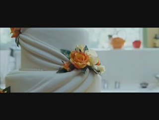
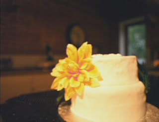
This shot wasn't that tricky to set up, but on our first day of shooting, the camera we were using was low on battery towards the end of the day, it produced some really weird streaking black lines to appear horizontally on the shot. We couldn't get rid of them in editing, but we re shot all the other shots from that day. So it all went well. The cake was made for us by Evie and her Mum, which, for a home made cake was brilliant, it looked a bit wedding-y, but we didn't have a budget. So wedding cake was probably out of reach for us. The shots are mirrored, which isn't a big deal. Also the lighting in our shot was a lot darker, this was because we were getting towards the end of our shooting day, and 4 o'clock was about when Jake's house got too dark to avoid continuity errors. This was also another reason why we re-shot some of the other shots. We lit the cake with a desk lamp being held by me to focus the shot on the cake.
This is my favourite shot that we did, it was done on a wooden dolly system that Jake made in his youth and hasn't been used since. It made a really smooth shot. The lighting in this shot was perfect, it was bright, with some artificial light, but it isn't really noticeable in the short time of the shot. The layout on screen is twinned between the two shots. Our best work yet.
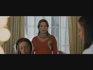
This shot was another great layout of the shots, with the people in the right place. Although more of the make-up girl can be seen. Not to mention the script and shot-by-shot guide left on the table. Soz. The lighting in the room made it more orange, which could have been dealt with in editing, but as this project wasn't part of our overall grade, I think we slacked a smidge. The actors didn't have to do much, but we wanted to get the weird hand thingy that the bride does in.
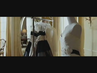
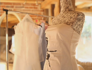
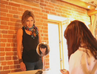
We were limited on the amount of room that we had, so everything was a bit more squished in, but we had to work with what we had. We got everything in frame where it should be in this shot. Including the bride in the little mirror, I thought that was a nice touch. The original shot had less zoom on, but we couldn't have made the shot perfect with the amount of room we had, this made the mirror a lot smaller and the mum a lot bigger unfortunately. Also Jake's mum in this shot is wearing my mum's scarf. Detail or what!
This shot was lined up pretty well, it wasn't particularly hard to do the second time as we'd already done this shot the weekend before and the film went all skewiff. The plant was still in roughly the right position, but because of the geography of the room, the only way we could get the flower in shot would mean that it had to be out of focus. The costume we left for the actors to decide on, so long as they wore clothes similar style to that of the original characters.
This back shot was easy to line up, but along with the area of the room again, it couldn't be matched up perfectly. We still got all the characters in frame, along with the sofa being at the same angle with the bottom of the frame.
Phil's first position shot was the first shot we did, shot in a field at the back of Tuttles Lane. We got Bill's dad to bring a very nice car to this field and we began to set up the shot. Each character was related back to the original sequence. We couldn't have someone sitting on the car, because the bonnet would most likely buckle under the weight, so we improvised. Jamie at the back did a great job of peeing in a bush for about 15 or so minutes. Luckily he wasn't method acting. Phil's costume wasn't the same, it wasn't very dirty, although we had just come straight from school. And also it wasn't a low-cut top, like the original. But in my defense it was bloody freezing.
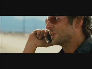
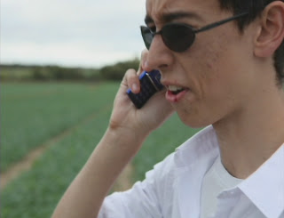
The second position in Phil's shots was also easy, we re-aligned the shot so that something that wasn't Tuttles Lane was in the background and shot the entire conversation again. The make-up was byro, it wasn't very tasty. The alignment on this shot again was great. Although because I'm not as muscular as Bradley Cooper my feeble arms didn't stretch the same distance.
As I said the previous post, the titling wasn't perfect and could have been better, but we still did a good job on it. The original titling was small and slightly more in focus, but I still that for a AS Media project we did damn well to match it up.
My opinion of our finished work;








No comments:
Post a Comment