Showing posts with label Outside Schoolwork. Show all posts

08/11/2011

Ratatouille: Camera Shots and Mise en Scène Connotations

Ratatouille may seen to most people as a film that is focused towards children, and yes, it is. But the effort that goes into making it is humongous, the people at Pixar don't hesitate to put as much effort that goes into an best picture winning film, that they put into any of their films. Of course there is a major difference between the technologies used in an animated film from a real-time flick, but the basic skills are the same.

I've was watching Ratatouille as I was writing my blog post about camera shots, and it really got me focusing on the camera shots used in the ending scenes of the film and how they affect the audience.

Here's a shot-by-shot analysis of the big ending scene.

The beginning shot taken out of context really sums up what the objective of the character is, he has to face what is behind these doors. The low angle shot makes the character seem big, but because he is out of focus it makes the doors seem more important. Even though he has the ability to complete the task, he still has to climb a mountain. The angle that the camera is set provides a point of view where the lines of the door make them seem like a mountain.

In this shot the father of the main character, Remy, is telling him that he finally understands what his son is doing and is proud of him for following his dreams and going past everything that his father has told him to get there. The shot is set so that the audience can see all of the on-screen characters.

This over shoulder shot gives a high angle shot of Remy, which makes the audience feel more pity for the character, and even though the difference in the characters has more to do with the high angle, it still makes it seem that the father is in control of the situation. This is foreshadowing for how the father can help Remy, or not as will soon be found out by the audience.

Here the same effect is being made, as the father is being viewed from a low angle shot, giving him the greater height in the scene.


This is the foreshadowing that the previous two shots have been making, where the father gets the rest of the family to help Remy complete his dream. This wide shot allows the audience to understand the situation and how insignificant Remy really is without help. The rest of the rat family take up half of the shot, and are facing Remy who is on the other side of the frame, but doesn't take up any of that half.

Just after the entire rat family has come over and Remy's father says that the gang will help him. Then a health inspector walks in, one group of the rats goes after him as he frantically tries to start his car. The shot of him hurriedly trying to start his car is focused on by having a close-up of him trying to turn the key in his car which makes the audience more aware of the harassment that he is having about starting his car.
This shot zooms out and shows what a predicament the man is in, with the rats crawling all over his car, the zoom out finally puts the situation into the audiences eyes. Also the view of the health inspector's eye in the mirror gives a sense of fear and unease towards the character, but because the health inspector would have stopped the main protagonist otherwise, the audience doesn't feel as much of a connection with the inspector.

This close up of his eyes still increases the audience's awareness of his panic, also the rats running across the foreground of the shot, but out of focus makes the audience believe that the inspector is trapped by the rats. For me it also gives an image of bullies, with the classic shot of someone about to be beaten up with the figures of the bullies on either side of the shot and the victim in the centre with a terrified look on their face.

Another close up of the man's foot stomping on the accelerator pedal of the car lets the audience know fully what is happening, and because of the quick change of shots, it gives the scene a greater sense of panic.


This shot is a cut-away shot of what Remy is looking at, and his next idea in the restaurant. He always focuses on hygiene, which makes the other rats see him as a kind of freak with how hygienic he is. The close up of this sign gives that sense of hygiene.

This very-wide shot of Remy shows his control over the rest of his family, in the background. With Remy in the foreground it gives the audience with only Remy to look at, with the family behind him it makes the audience believe that he is the chief of all the other characters on screen. He also points in a direction and tells the characters to go that way and they do very quickly, giving the audience a better belief of his chiefness.

This wide shot of the kitchen shows that Remy is on the way to getting his dream coming true. It also shows how organised and OCD Remy is, with all the rats in their different battalions and platoons it gives a sense of discipline on Remy's part. The way that the rats are using mops to get themselves up onto the cookers and such reminds me of ladders going up to battle like in WWI and Medieval battles going over a castle wall. With the wide angle shot, it gives the audience the sense of amazement that has never been met with what is going on in this final big scene.

This shot gives another amazement session for the audience with a human character in the shot it can help provide a size reference for the audience which is procrastinated by the human character being in the foreground, with depth of field it makes it a false reference. The shot also shows that the rats are capable of doing things that humans can do, but quickly because they are all working together.

The human, Linguini, has just pointed out the big factor that there is no-one waiting the tables in the restaurant, and the next shot is this. The close-up of the roller-skates may provide a bit of comedy for the audience, which I find it is because it is completely random. But still it makes the scene seem more hectic than it already is for the audience. As if the rats cooking wasn't already enough.

This shot of Linguini pouring wine on the go for the partial villain of the film. The way that the villain, Ego, isn't fully shown and what is is his back and right arm. This makes him seem bigger and a darker character as not much of him is shown. Also Linguini is blurred because of the hurry that he is in.

Another shot showing how in control Remy is. In the driver's seat.
The focus is on the food, which shows a connection to what the character is doing. It's his job bro.


This is also what the entire scene has been building up to, with this small action of Ego's being the entire conclusion to the scene. It's one small bite for man, one giant leap for rodent kind.

 This is Ego's reaction to the food, obviously something is wrong, with him being in a shocked state. It makes the audience feel that Remy has either succeeded, or for me; killed him. But the next shot is of Ego as a child, therefore the audience know that the food was so good it tastes as good as when food does as a child.

 Yes, the food was so good; he drops his pen. But this still doesn't detract from how the character has amazingly reacted to how amazing the food was.
 This shot is a POV shot from the villain of the story, who previously worked at the restaurant as the boss until Linguini overtakes him as boss. He is furious over who has cooked the food and jumps into the kitchen like a boss, and sees rats working in the kitchen. The shot tries to get the audience to have the same reaction as the villain by using a POV shot, but I don't think it has the right effect as the entire film has classed rats as good.

 This shot is when Ego is being told who the chef is, which is shown with Remy being the same size as Ego, which shows that Remy has managed to beat Ego, and that Remy is no less of a human that Ego is.


Thas a lot of writing.

28/10/2011

Filters and Effects

I've been experimenting around with different effects that give a Watchmen look. I didn't really get anywhere for a while and eventually came up with a look that I liked and wasn't too hard to get to, I logged all the adjustments I had done to keep track of what was changed. I started with the basics of what I could pick out from the shots of Watchmen.


The shot is quite moody and sad. This is made by the contrast being very high, the saturation being quite low, and a photo filter which in this shot is a light brown. Although the background in this shot is probably a image laid over a blue screen, which would give the director an infinite choice of the mood of the shot in post production. The choice made was to have the shot reflecting the character, and made it a very depressing and bland shot. The focus is also drawn to a badge the character is holding, this is done by selecting a colour that isn't affecting by the filter. In other shots there is no focus and everything in the shot is drab. 

I tried reaching the same effects by applying what I thought would achieve the same effects. I started out with one tester image of what I was trying to get to:


I applied a full contrast, took away half the saturation of the image, sharpened the edges three times and an overall sharpen effect. Then I chose a filter to apply to all of the image, which I chose as a very dark blue with a density of about 30%.

I think that this effect worked well, although there was a bit too much noise created by the sharpening effects, also because the shot was outdoors looking into a dark area with an overexposed area to the left of it, the over exposed portion was blurred and wiped away by the high contrast.


This is the original photo, I did attempt to changed the over-exposed part but it only ended with one area being too exposed or the entire image losing it's contrast and detail.

I also experimented with layers that pronounced the edges more clearly, this worked but again it created noise on the edges.

Here are some more shots that I used a perfected the shot overall shot effect:

   Above: Edited. Below: Original


   Above: Edited. Below: Original

When I get the chance I will set up some sort of shot that will be similar to one that I plan to get in the final coursework I will apply the effects and tweak them to suit the shot.

26/10/2011

The Coursework Is Here...

Yeh, that time has come. But on the other hand it is Media coursework, so if anything it's enjoyable. Yeeeeeeehaaa. Ever since I started this course I knew what coursework would be involved, so I began thinking about a story for the movie intro that I would eventually make. Ideas went through my mind, I had a few ideas in mind that I waited to have my full judgement on after my first experience on a movie set, and an experience about how to work with other people on set.

Most of the ideas I had were just wiped out by what would be possible as a student. I have a few left, but I'll see what the deadline is for the task.

The main things I've been playing around with are trying to get the right look of the overall visuals of the shots. I've been watching Zack Snyder's The Watchmen recently and I really like the way his shots have a high contrast & sharpness, and most of the shots have very low saturation.


The high sharpness and moody saturation really gives an overall emotion of depression and sadness of the entire film. I'm going to experiment with a few different effects and document them on das Blog.

I also wanted to use some really smooth camera movements, like we used in the Hangover project, but a lot more slower. Some form of dolly system that doesn't have have rails, as I wanted to use it to zoom in on a character to produce tension and curiosity, and if the rails are placed in front in the same direction as camera angle, then they'll be in shot. So something that can hold a camera at around sitting height and doesn't show it's railings in shots.

I'm going to go ahead with some, experimentation...

24/10/2011

Evaluation Time.

Come along children I'm going to read you an interesting story of what went good or bad with an AS Media Studies project.


So basically I'm gonna go through all of the main focus shots and say how I think it could have been better.


This shot was lined up really well, we didn't have a decent amount of people to have like in the original, but we lengthened the shot by spacing the to people out. The props were also limited, we were going to have some real flowers, but we were stressed out from the rest of the organisation, I think that the replacements of fake greenery still did well. We borrowed the van from one of Bill's Dad's Friends, who coincidentally was in Las Vegas. We haven't heard much from him. The font for the titling was a very close match, and the placement was pretty easy. A well duplicated shot.


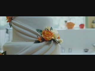
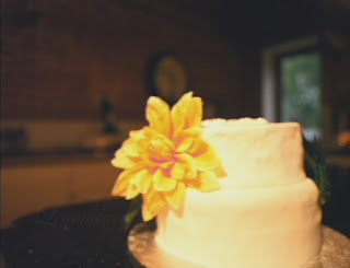
This shot wasn't that tricky to set up, but on our first day of shooting, the camera we were using was low on battery towards the end of the day, it produced some really weird streaking black lines to appear horizontally on the shot. We couldn't get rid of them in editing, but we re shot all the other shots from that day. So it all went well. The cake was made for us by Evie and her Mum, which, for a home made cake was brilliant, it looked a bit wedding-y, but we didn't have a budget. So wedding cake was probably out of reach for us. The shots are mirrored, which isn't a big deal. Also the lighting in our shot was a lot darker, this was because we were getting towards the end of our shooting day, and 4 o'clock was about when Jake's house got too dark to avoid continuity errors. This was also another reason why we re-shot some of the other shots. We lit the cake with a desk lamp being held by me to focus the shot on the cake.


This is my favourite shot that we did, it was done on a wooden dolly system that Jake made in his youth and hasn't been used since. It made a really smooth shot. The lighting in this shot was perfect, it was bright, with some artificial light, but it isn't really noticeable in the short time of the shot. The layout on screen is twinned between the two shots. Our best work yet.


This shot was another great layout of the shots, with the people in the right place. Although more of the make-up girl can be seen. Not to mention the script and shot-by-shot guide left on the table. Soz. The lighting in the room made it more orange, which could have been dealt with in editing, but as this project wasn't part of our overall grade, I think we slacked a smidge. The actors didn't have to do much, but we wanted to get the weird hand thingy that the bride does in.


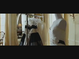
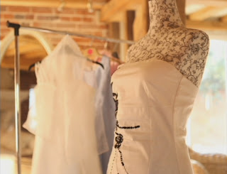
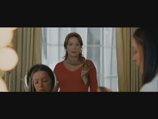
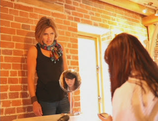
We were limited on the amount of room that we had, so everything was a bit more squished in, but we had to work with what we had. We got everything in frame where it should be in this shot. Including the bride in the little mirror, I thought that was a nice touch. The original shot had less zoom on, but we couldn't have made the shot perfect with the amount of room we had, this made the mirror a lot smaller and the mum a lot bigger unfortunately. Also Jake's mum in this shot is wearing my mum's scarf. Detail or what!


This shot was lined up pretty well, it wasn't particularly hard to do the second time as we'd already done this shot the weekend before and the film went all skewiff. The plant was still in roughly the right position, but because of the geography of the room, the only way we could get the flower in shot would mean that it had to be out of focus. The costume we left for the actors to decide on, so long as they wore clothes similar style to that of the original characters.


This back shot was easy to line up, but along with the area of the room again, it couldn't be matched up perfectly. We still got all the characters in frame, along with the sofa being at the same angle with the bottom of the frame.


Phil's first position shot was the first shot we did, shot in a field at the back of Tuttles Lane. We got Bill's dad to bring a very nice car to this field and we began to set up the shot. Each character was related back to the original sequence. We couldn't have someone sitting on the car, because the bonnet would most likely buckle under the weight, so we improvised. Jamie at the back did a great job of peeing in a bush for about 15 or so minutes. Luckily he wasn't method acting. Phil's costume wasn't the same, it wasn't very dirty, although we had just come straight from school. And also it wasn't a low-cut top, like the original. But in my defense it was bloody freezing.


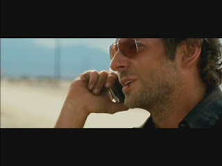
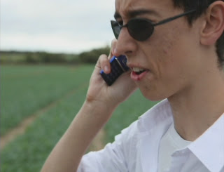
The second position in Phil's shots was also easy, we re-aligned the shot so that something that wasn't Tuttles Lane was in the background and shot the entire conversation again. The make-up was byro, it wasn't very tasty. The alignment on this shot again was great. Although because I'm not as muscular as Bradley Cooper my feeble arms didn't stretch the same distance.


As I said the previous post, the titling wasn't perfect and could have been better, but we still did a good job on it. The original titling was small and slightly more in focus, but I still that for a AS Media project we did damn well to match it up.

My opinion of our finished work;